RETROLIGHT / ORA / KAEN
A name becomes a presence.
A name is where the introduction starts. Identity gives people something to recognise, whether they encounter the business on a screen, in print or in person.
These selected Morph assignments cover brand identity for Retrolight and ORA, and brand identity and website work for Kaen.
Retrolight
Brand identity
Brand identity work for Retrolight.
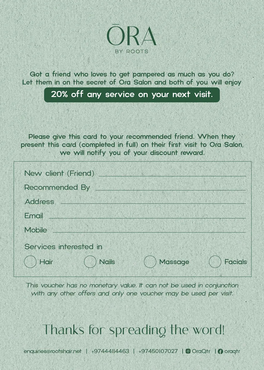
ORA
Brand identity
Brand identity work for ORA.
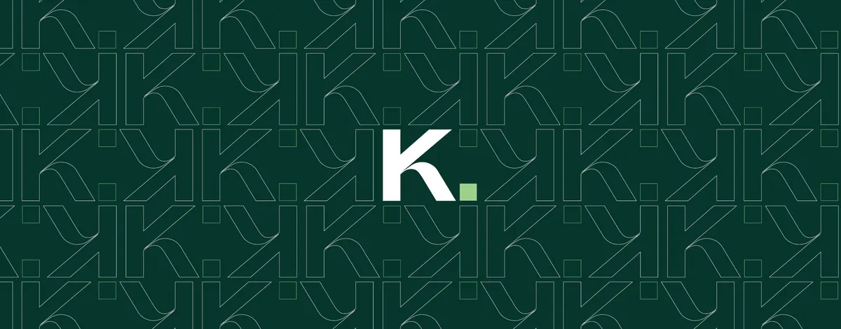
Kaen
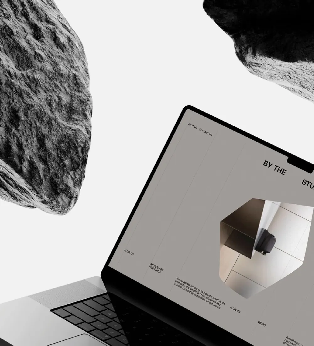
Brand identity and website
For Kaen, Morph's scope included both brand identity and a website. A website gives an identity another setting: one where people read, navigate and decide what to do next.
“You never feel like just another client. There’s real care, presence, and thoughtfulness in how they work.”
Where will your identity need to work?
A website, campaign or physical experience gives an identity somewhere to live. Bring us the business context and the places where people will encounter the brand.
Bring us the brief
Explore Creative & Production
Explore LC Waikiki Ramadan & Eid
Back to all work